
PART 1: The Art of Visual Storytelling & Animation
Q: You’ve been a Senior Character Animator bringing life to major franchises like Despicable Me and Klaus. In animation, you tell a story visually on a flat screen. With Garuda’s Premium Sea Salt, you are dealing with a tactile, physical product. What core principles of visual storytelling did you bring over from animation to design packaging that consumers can actually touch and feel?”
A: The technical principle is identical: composition! In animation, you’re composing movement within a camera shot, every element positioned to guide the eye and communicate hierarchy. With product design, you’re composing a physical object that the viewer approaches from multiple angles and holds in their hands.
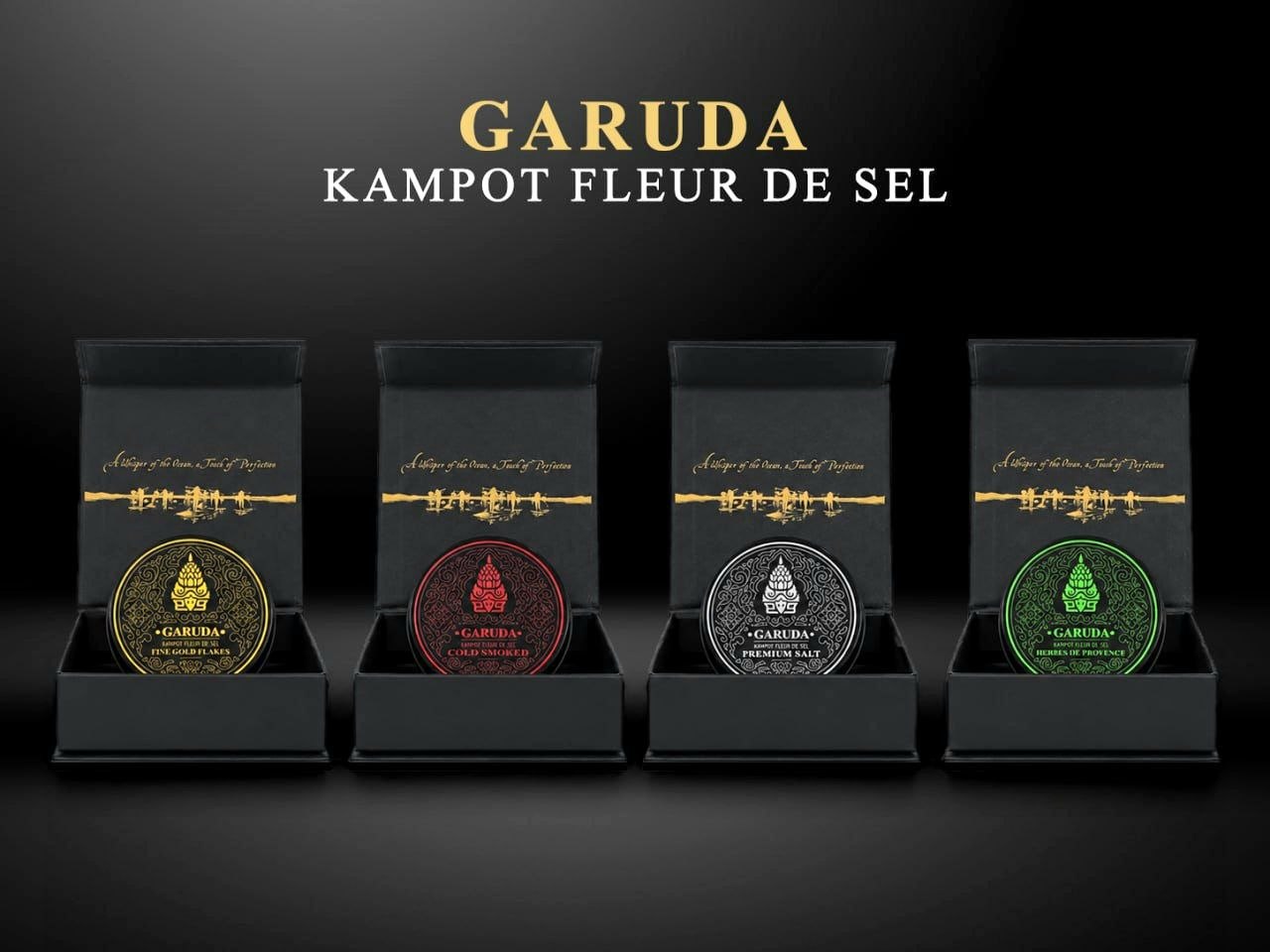
With Garuda Premium Sea Salt, I applied animation principles even in the unboxing sequence, how the lid lifts, the reveal of the product, follows the same pacing logic I use in animation: build “Anticipation”, deliver the moment “Action”, let it breathe “Reaction”.
When someone holds a package of Garuda, they should feel the same way they do watching a beautifully animated masterpiece. It’s a different medium from filmmaking, but the principle is identical: create an instant emotional response, and give people a moment of genuine magic.
PART 2: The Cambodian Connection
3. The Journey to Phnom Penh, “Your work includes Funan, a visually striking animated film rooted in Cambodian history, and you’re now based in Phnom Penh. How has your connection to Cambodia evolved? You’re French—and fleur de sel is France’s famous product. Why Kampot Fleur de Sel, and why Garuda?
A: I’ve been evolving side-by-side with Cambodia for over 15 years! I didn’t arrive here with a business plan; I immediately fell in love with the country and with its people’s generosity. When I worked on Funan, my goal was specific: give the Cambodian youth the opportunity to create an international animated feature film about their own history, and do it at the highest global standard.
Living here, I realized that while the local heritage is magnificent, its brilliance lacked global visibility. Kampot Sea Salt or Fleur de Sel is a world-class masterpiece protected by a prestigious Geographical Indication. Garuda Premium Sea Salt celebrates this Cambodian legacy, transforming an exceptional harvest into an exquisite, high-end experience. It’s all about showing the world that Cambodia does not follow trends; it creates them. We produce world-class luxury.
PART 3: The Garuda Brand & Global Vision
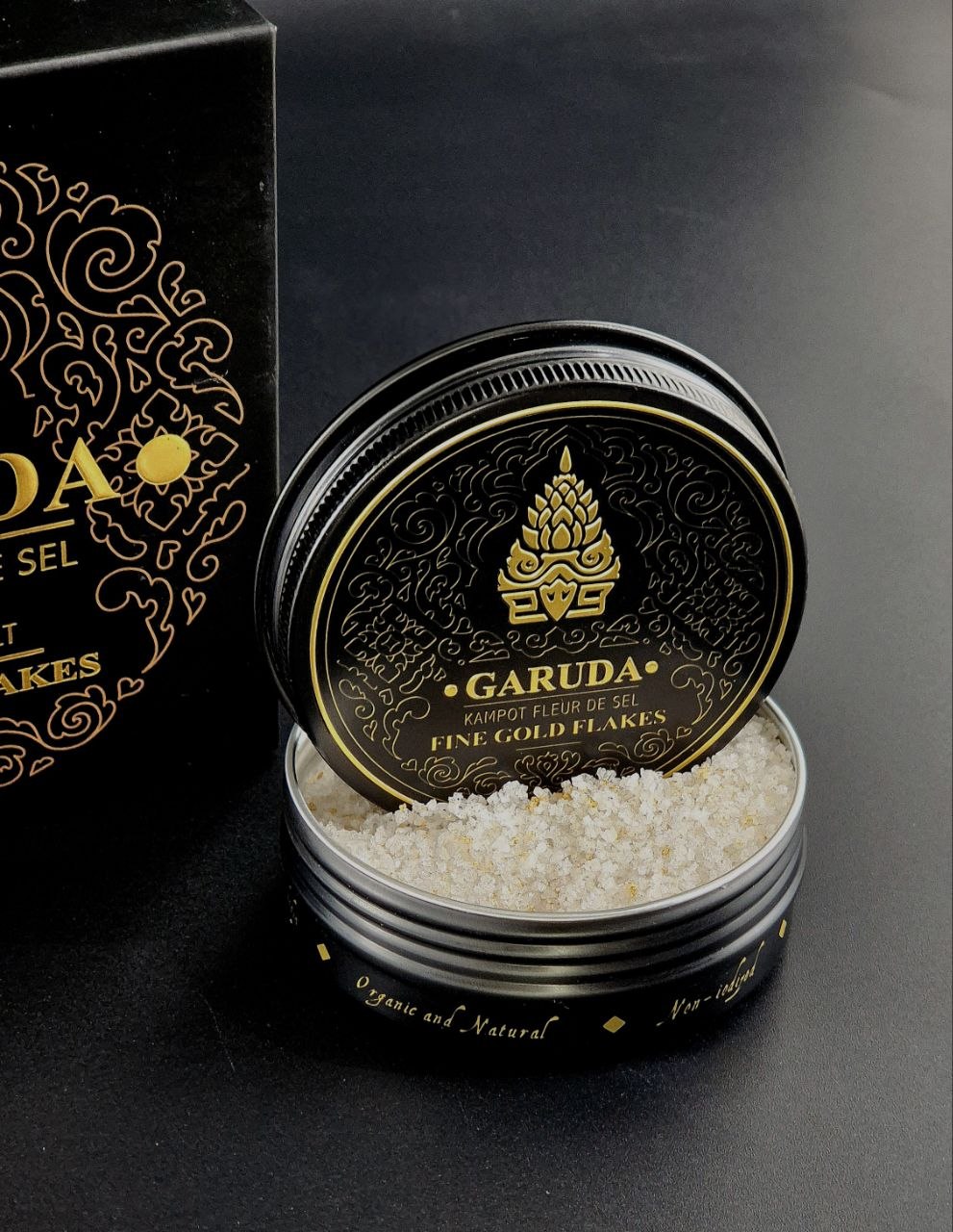
4. Communicating ‘Premium’ Through Design “Garuda isn’t just everyday salt; it’s Kampot Fleur de Sel with a highly respected Geographical Indication (GI) certification, featuring luxurious options like Cold-smoked flavors, Fine 24-carat Gold Flakes and Herbes de Provence blend. As a designer, how did you approach the visual aesthetics and packaging to ensure it instantly communicates this ultra-premium, world-class quality to a buyer?”
A: Luxury lives in the details invisible at first glance: the weight of the box, the typography choices, the breathing room around the product, the velvet interior. These whisper more loudly than any traditional marketing. Our goal is to simply honor the pristine purity and rare character of this salt, allowing its unique voice and timeless aura to resonate throughout the world.
I designed Garuda’s premium look to belong in a Michelin-starred restaurant or a luxury gift boutique. When anyone picks up a box of Garuda Premium Sea Salt, they see: heritage, geographical legitimacy, and premium execution. Gold flakes aren’t just for the garnish, they’re a visual statement that this is an experience, not a commodity.
5. Balancing Local Heritage with Global Appeal, what specific design elements or cultural motifs did you incorporate to honor Kampot’s origins while appealing to international luxury buyers?
A: The logo draws from Kampot’s most iconic landmark, the Durian roundabout.
But reimagined. Within it, I subtly embedded the face of Garuda, the mythical bird deity in Hindu and Buddhist mythology. The base of the letter “G” echoes the brand name itself, creating a layered reference.
For the surrounding motifs and decorative language, I turned to Khmer cultural references, specifically Kbach Khmer, the traditional ornamental patterns. But the execution is contemporary and restrained.
This is the balance: authenticity without nostalgia. The typography is clean and modern. The visual language respects the product’s integrity rather than ornamentalizing it. To international luxury buyers, this signals something crucial: Cambodian craftsmanship isn’t a novelty or a trend, it’s an established standard of excellence.
Q: Coming from Illumination Studio Paris, you understand what captivates global audiences. What’s your vision for Garuda Premium Sea Salt’s future, and how can design shift global perception of Cambodian exports?
A: Garuda Premium Sea Salt is proof that design is a multiplier. The salt itself is exceptional, but without the right presentation, it’s invisible. My vision is to establish Garuda as the gold standard—literally and figuratively—for Cambodian premium goods. This isn’t just about salt; it’s about repositioning Cambodia’s image internationally.
When consumers choose Garuda over French, UK or Italian alternatives, they’re not just buying salt; they’re endorsing a narrative: that Cambodia is a source of world-class luxury. That opens doors for other Cambodian products. Design is how small countries tell big stories.
I’ve spent my career giving personality to animated characters and franchises; now I’m doing the same for Cambodia. The goal is simple: make Cambodian luxury irresistible, globally recognized, and inevitable.
Footnote:
Explore the full expression of Cambodian luxury and our curated salt blends at www.kampotseasalt.com
For updates and behind-the-scenes artistry, connect with us on Facebook: https://www.facebook.com/GarudaPremiumSeaSalt